Background
In e-commerce, the search feature is vital, serving as a key user engagement aspect. Ruparupa, like other platforms, faces the challenge of optimizing this feature.
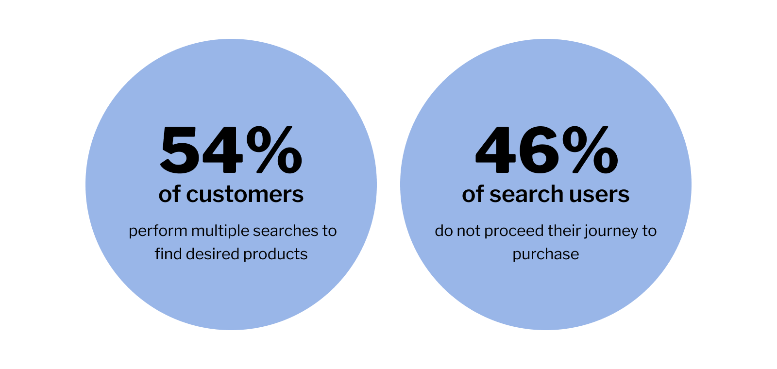
Analyzing data from Q1 2022 to Q1 2023, a decline in search module conversions was evident. This coincided with an increase in user searches per session. Recognizing this, we aimed to uncover the root causes and enhance the search function for improved shopping conversions.
Research Strategy and Phases
To address the identified challenges, we adopted a structured approach with clear objectives:
- Understand current user pain points in platform search.
- Identify user needs for enhanced searching.
- Pinpoint platform improvements to meet user needs.
Aligned with our goals, I collaborated with the project manager to create a detailed plan. Acknowledging the research complexity, we divided it into three phases for a systematic exploration. This strategic approach ensures a comprehensive exploration to generate solutions meeting customer needs.
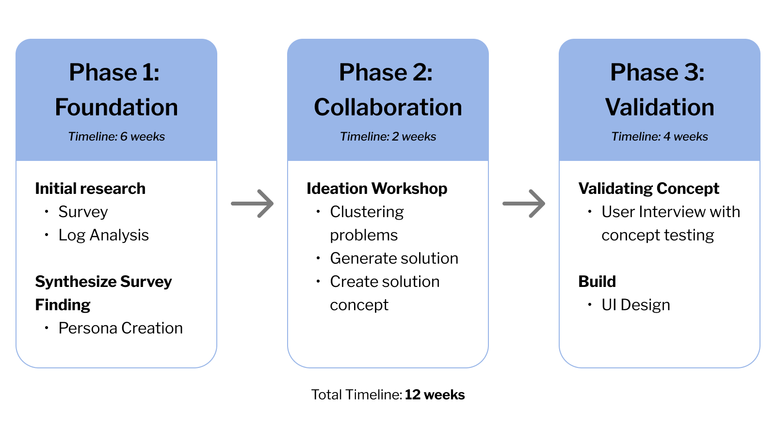
We chose a survey to quickly collect quantitative data for the ideation workshop. Next, solutions from the workshop will be tested in 1on1 user interviews with concept testing.
Survey Planning and Execution
Our survey planning aimed to validate assumptions and gather insights on crucial aspects of the search feature: Behavior, Usability, Accuracy, Satisfaction, and Comparison.
Target Audience Criteria
- Active users within the last 3 months.
- Users who engage with the search feature.
- A diverse mix of genders.
- Participants from Indonesia.
Sample Questions
- Behavior: How frequently do you use the search feature on our platform?
- Usability: What difficulties have you encountered when using the search feature?
- Accuracy: How often do you retype your keyword until finding the desired product?
- Satisfaction: How frequently do you click on a product card to view details in the search results?
- Comparison: What are your thoughts on our search feature compared to other e-commerce platforms?
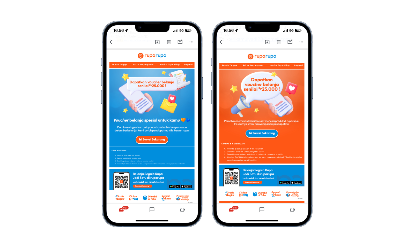
Conducted over a month, our survey reached our active user base through email and push notifications, yielding a valuable pool of 140 responses. This methodical approach allowed us to gather actionable data, informing subsequent phases of our UX research with real user feedback.
User Persona
Building upon our survey findings, we were able to classify users relying on the search feature into four distinct personas.

Collaborative Ideation Workshop
Responding to survey findings, we expanded collaboration with a diverse team of 25 individuals from various departments including front-end, back-end, project management, marketing, content writers, and data experts.

As the facilitator, I guided dynamic discussions, leading to the identification of five key opportunities: Keyword, Recommendation, Search Result, Product Attribute, and Filter.

Our ideation session produced 14 potential solutions, narrowed down through a voting process to the top four: Collapsible Filter, Personalized Filter, Product Recommendation Position, and Detail Quick Look on Product Card. These prioritized ideas will undergo testing with customers to ensure alignment with their preferences and needs.
Validating The Concepts
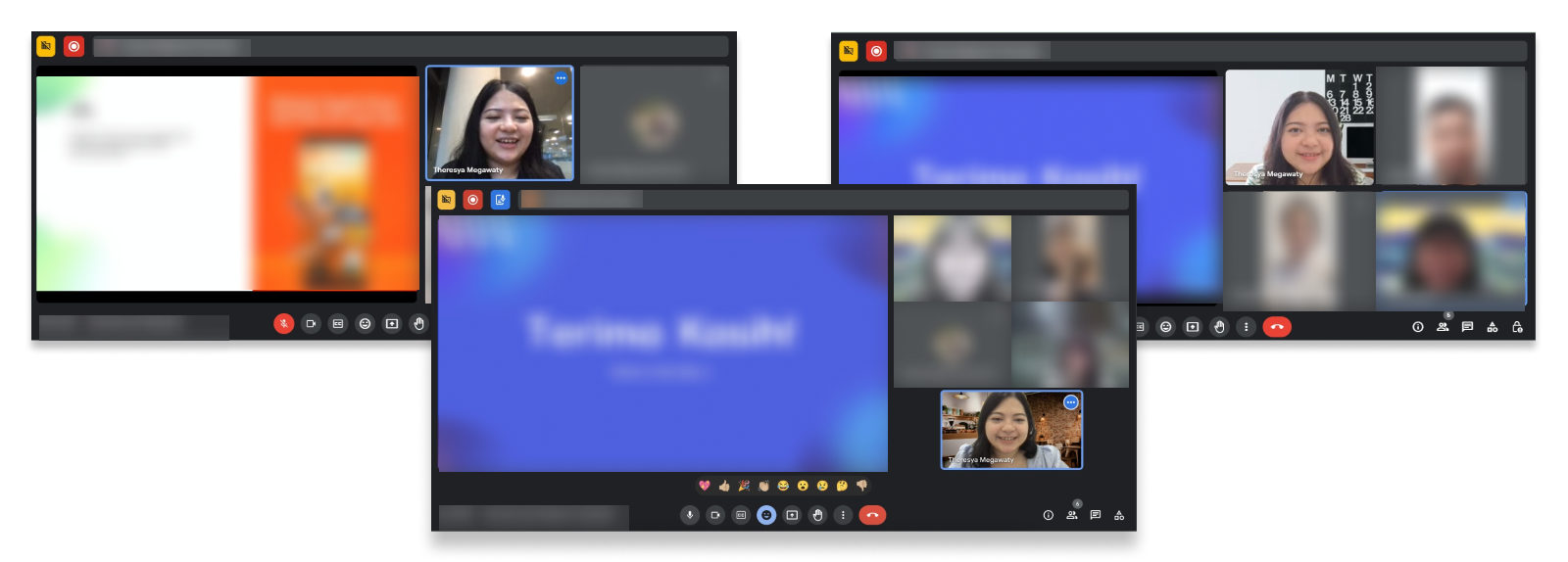
In our ideas validation phase, we engaged with 8 carefully selected customers matching our personas. Beyond confirming concept viability, these interviews delved into customer pain points and areas for current flow and interface improvement.
To ensure a structured and effective validation process, I prepared essential tools for the team, including a Notetakers Template, a comprehensive Discussion Guide, and an Interview Deck.
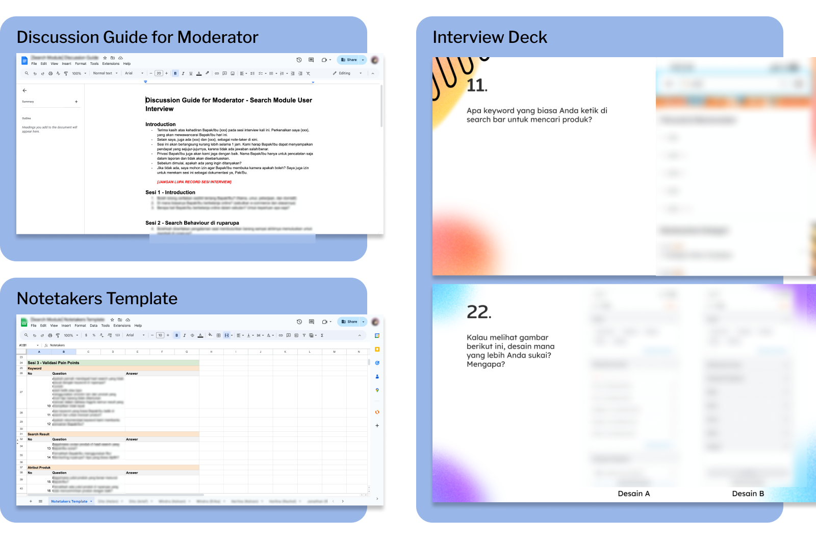
Conducted over a week, online interviews provided rich insights directly from users, crucial for refining solutions to align closely with user needs.
Feedback, Ideas, and Insights
Presenting our concepts yielded compelling feedback, with most participants endorsing their potential effectiveness. However, the Detail Quick Look on Product Card concept faced resistance due to its uncommon behavior, emphasizing the importance of aligning with user familiarity.
Beyond validation, sessions generated ideas for enhancing our current design, such as a shortcut to the promo page from search results and product naming suggestions. These insights are instrumental in refining our solutions, ensuring alignment with user expectations for an improved overall experience.

Refining Solutions
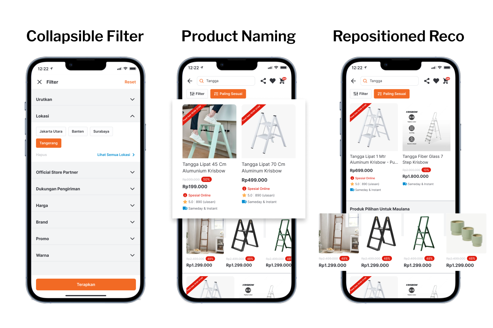
After further refinement, the solution was divided into two; improvements and proposed new features.
Enhancements for Current Feature
- Collapsible Filter for Accessibility
Transformed the filter into a collapsible format, enhancing user access and visibility, streamlining the experience - Optimized Product Naming
Proposed prioritizing product name and function over the brand name, ensuring clearer communication. - Repositioned Product Recommendations
Strategically moved down product recommendations in search results to reduce distractions and improve navigation, acknowledging user behavior.
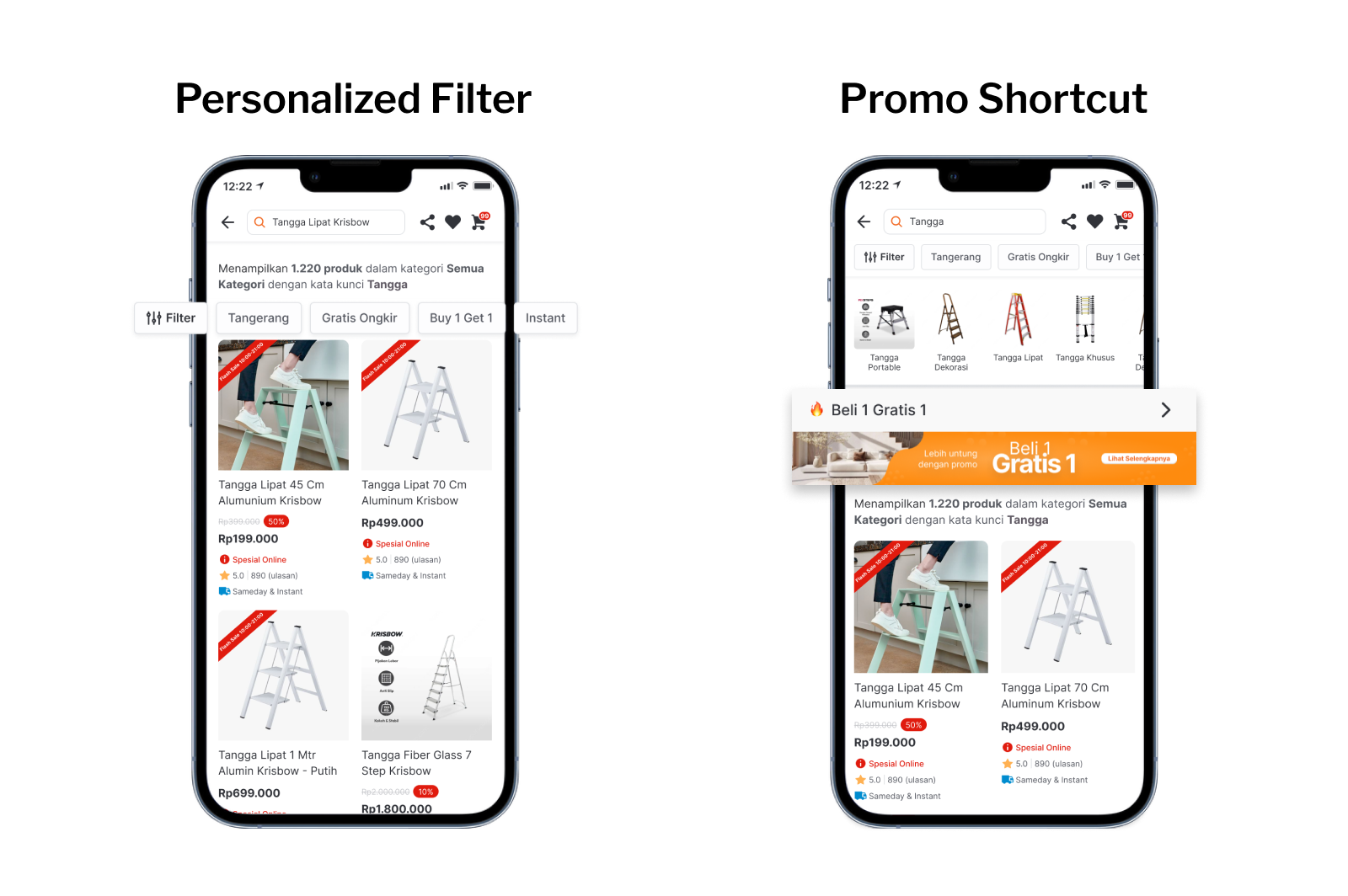
Proposed New Features
- Personalized Filters for Seamless Refinement
Suggested personalized filters based on users' frequently used filters for a smoother search refinement process. - Efficient Promo Page Shortcut
Recommended a shortcut to the promo page, responding to user demands and enhancing overall satisfaction.
Reflections
- Optimizing Workshop Dynamics
For future workshops, I prefer smaller groups with a maximum of 10 participants to streamline discussions. Larger groups tend to extend discussion times, and reducing participants minimizes distractions for heightened focus. - 5 Users is Enough
In user interviews, interviewing 5 individuals proves optimal, effectively representing a significant portion of the user population. Beyond this, insights may not align proportionally with the increased effort. - Fostering Collaborative Passion
The project's success was enriched by the shared enthusiasm and passion of collaborators. Working with a team of shared excitement contributed to a positive, productive atmosphere, fostering creativity and commitment.