Problems
With the growth of Ruparupa.com as an e-commerce, more and more discount and promotion programs have been initiated. This is welcomed by users who want to get the advantage of shopping cheaper with discounts.
One of the problems is that the voucher list page is only on the profile page. Sometimes users forget about existing promos and often don't use the discount voucher.
The Process
Teaming up with a product manager, we agree to gather people from other divisions to find business needs, and specifically ask questions to the customer service team to find voices from users.
It turns out that this problem has become a high priority for the customer service team who often get questions about vouchers. In addition, according to the marketing team and data team, vouchers have a fairly high conversion rate, so this problem creates a large potential for losing sales

Competitor Analysis
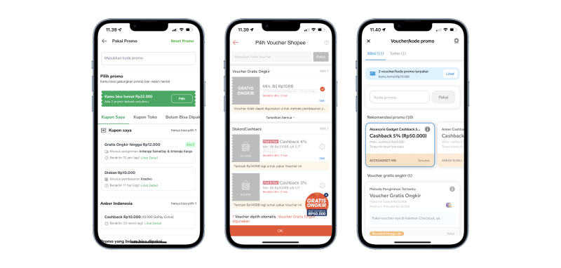
We started by looking at our competitors and what they were already doing. There are some things they all have in common.
Firstly, at checkout, they have a special section where they list all the vouchers. They also directly filter which vouchers can be used in transactions, making it easier for users. Second, all vouchers have an expiration date that counts down. This makes users even more excited to shop and use vouchers.

Solving The Problems
Based on existing issues and insights from competitor analysis, we decided to create a voucher wallet on the checkout page. It will contain all vouchers owned by the user. Even so, the form field to enter the code manually is also not removed, because based on research there are also users who are more comfortable using the form field to use vouchers.

Turning The Idea Into Design
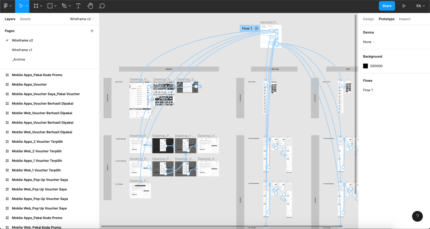
After getting the idea, I decided to just put it in a lo-fi wireframe to make it more visual. I also linked each page into a prototype so the idea could be more easily grasped.

Visual UI
After several back and forth discussions with teams from other divisions within two months, our idea was finally approved. Then me and a ui/ux intern began to prepare a more high fidelity design file to be given to the front end and back end teams.

The Aftermath
In just two weeks after this feature was launched, overall sales increased by 9% and number of orders increased by 18% with more than 50% of new sales coming from the voucher wallet feature.